
by Megan Brown, Student Reporter
The state of Oklahoma recently made the decision to rebrand itself with a new logo and slogan.
The new brand will soon be seen on welcome signs, license plates, and other materials.
Governor Kevin Stitt said during an interview: “We feel like we came up with a world-class brand. It was by Oklahomans, for Oklahomans.”
The process of creating the new brand started during the summer of 2019 and took over nine months to complete.
People from across the state who are in different forms of advertising and marketing volunteered their time to help create the new image for the state.
While a large majority of the creativity was found within the state, a company out of Canada was paid to finalize the project.
According to The Oklahoman, this was done because officials did not believe that choosing one branding firm in Oklahoma would benefit the state. Lt. Governor Matt Pinnell said if one firm had been chosen, others would not have been willing to bring their ideas forward.
The new tagline, “Imagine That,” will soon be found across the state. While there have been some controversial views over this slogan, the wording was meant to be open-ended in an attempt to hint at all the hidden treasures the state has to offer.
After the slogan was revealed, many took to social media to share their opinions.
“The phrasing ‘Imagine That’ almost comes across as sarcasm,” April Shultz, a NWOSU student said. “People often say that when they are trying to imply that they already know what is being said to them.”
While Shultz does see the sarcasm, she also believes that the state was ready for an update.
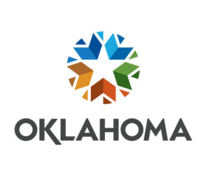
As for the image, the new logo consists of many different colors in the shape of a circle with a star in the center. The shape is meant to represent that the fact that Oklahoma is in the middle of the United States.
The color range is to symbolize the different earth tones found within the state. For example, the blue represents water, while the red hints towards being the red-dirt state.
The layout also pays tribute to those who have served within the state.
As for the star in the center, this is directly related to American history and the stars upon the American Flag.
Along with months of time, this creative process also used thousands of dollars. While a large amount of work was volunteered, according to Pinnell, more than $200,000 was put into the project. This money was put towards the Canadian company that handled the rebranding and launch.
Oklahoma taxpayers were responsible for paying $100,000 of this cost, while the other came from private investors.
This number also raised some concern from residents of the state. Many started to wonder if the new branding was worth over $200,000.
Many social media posts were raising questions of why tax dollars were not being put towards things like fixing streets and other issues across the state.
While the controversial conversations continue on the web, Stitt and Pinnell both said they believe the new branding represents that state well.
“Together these elements form a circle and direct their energy inward again dramatizing Oklahoma as a hub, the center of America,” Pinnell said during the unveiling.